Introduction to Employee Attrition Prediction
Employee attrition, or turnover, is a critical concern for organizations worldwide. Understanding and predicting which employees are likely to leave can help companies implement retention strategies and reduce costs associated with hiring and training new staff.
The attrition rate (AR) is calculated as:
\[AR = \frac{\text{Number of employees who left in Period X}}{\text{Number of employees employed in Period X}} \times 100\]Data Preparation in R
Before we dive into the analysis, let’s first understand how to prepare our data in R. One of the key concepts in R is the factor data type, which is used to represent categorical variables. Factors are essential for our analysis because they:
- Store categories as integers for efficiency
- Maintain labels for human-readable output
- Are automatically converted to dummy variables in statistical models
Internally factor stores categories as integers (for efficiency in comparison to strings) with labels attached. The values can be either ordered or unordered. We call these unique values in factor levels. In statistical modeling, functions like lm(), glm(), and randomForest() treat factors as categorical variables and automatically create dummy variables.
x <- c("low", "medium", "high", "low", "high")
f <- factor(x)

print(f)
# [1] low    medium high   low    high
# Levels: high low medium
Let’s take a look at this line of code, which creates a binary factor variable named leave in the dataframe df. We will use df$leave as the dependent variable (label) in a classification task.
df$leave <- factor(ifelse(df$Attrition == "Yes", "Yes", "No"), levels = c("No", "Yes"))
- df$Attrition == “Yes” returns a logical vector (TRUE or FALSE) for each row.
- ifelse(…, “Yes”, “No) converts the logical vector into a character vector (“Yes” for TRUE).
- factor(…, levels=c(“No”, “Yes”)) converts the resulting character vector into a factor with two levels: “No” and “Yes”. The order here is important because many classification models treat the last level (“Yes”) as positive class by default.
- finally df$leave <- assigns the resulting factor to a new column called leave in the dataframe df.
This line of code ensures that we now have a proper factor type as label for classification. This is required by R models such as glm and randomForest. We are also able to control the order of factor levels thus making modeling more explicit and stable.
Data Exploration and Visualization
Before building our predictive model, let’s first explore and visualize our data to understand the patterns and relationships between variables.
summary(df[, c("Age", "MonthlyIncome", "EnvironmentSatisfaction", "JobSatisfaction")])
- df[, c(…)] selects a subset of columns from the dataframe df.
- summary(…) then provides statics for each selected column.
- For numeric variables (Age, MonthlyIncome), it display the following:
Min. 1st Qu. Median Mean 3rd Qu. Max.
Where:
- Min.: Minimum value
- 1st Qu.: First quartile (25th percentile)
- Median: Middle value (50th percentile)
- Mean: Average
- 3rd Qu.: Third quartile (75th percentile)
- Max.: Maximum value
- For factor or integer-coded categorical variables (JobSatisfaction (1-4)), it shows the count for each level.
1   2   3   4
100 150 120 130
Data Visualization
We use ggplot2 for plotting.
ggplot(data = df, aes(x = Attrition, fill = Attrition))
- ggplot(…) creates a ggplot object using df (dataframe) as data.
- aes: aesthetic mappings, which tells which variables from your data shoud be mapped to visual properties (aesthetics) of the plot.
- x, y: position on the axes.
- fill: bar or area color.
- color: line or point color.
- size: size of the points/lines.
- shape: shape of points.
- alpha: transparency.
ggplot(df, aes(x = Age)) +
  geom_histogram(binwidth = 5, fill = "skyblue", color = "white") +
  labs(title = "Age Distribution", x = "Age", y = "Count") +
  theme_minimal()
- We set Age for the x-axis.
- geom_histogram(…): Adds a historgramlayer, in which
- binwidth means each bar (bin) covers a range of 5 years.
- fill makes bar skblue color.
- color makes the borders of the bar white.
- labs(…) adds label to the plot:
- title = “Age distribution”, which is the title of the plot.
- x = “Age” is the label for x-axis.
- y = “Count” is the label for y-axis.
- theme_minimal() applies a clean, minimalist theme to the plot. It uses a light background, no gridlines with simple font and layout.
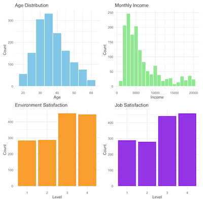
If we draw four individual plot and putting them together, then we get the plot displayed above:
# Install packages if needed
install.packages("ggplot2")
install.packages("patchwork")

# Load libraries
library(ggplot2)
library(patchwork)

# Convert satisfaction scores to factors
df$EnvironmentSatisfaction <- factor(df$EnvironmentSatisfaction, levels = 1:4)
df$JobSatisfaction <- factor(df$JobSatisfaction, levels = 1:4)

# Create plots
p1 <- ggplot(df, aes(x = Age)) +
  geom_histogram(binwidth = 5, fill = "skyblue", color = "white") +
  labs(title = "Age Distribution", x = "Age", y = "Count") +
  theme_minimal()

p2 <- ggplot(df, aes(x = MonthlyIncome)) +
  geom_histogram(binwidth = 1000, fill = "lightgreen", color = "white") +
  labs(title = "Monthly Income", x = "Income", y = "Count") +
  theme_minimal()

p3 <- ggplot(df, aes(x = EnvironmentSatisfaction)) +
  geom_bar(fill = "orange") +
  labs(title = "Environment Satisfaction", x = "Level", y = "Count") +
  theme_minimal()

p4 <- ggplot(df, aes(x = JobSatisfaction)) +
  geom_bar(fill = "purple") +
  labs(title = "Job Satisfaction", x = "Level", y = "Count") +
  theme_minimal()

# Combine into one layout
dashboard <- (p1 | p2) / (p3 | p4)

# Save to PNG
ggsave("dashboard_plot.png", plot = dashboard, width = 10, height = 8, dpi = 300)

# Or optionally save to PDF
ggsave("dashboard_plot.pdf", plot = dashboard, width = 10, height = 8)
Building Predictive Models
Linear Model
Let’s start with a simple linear regression model to understand the relationship between our variables and employee attrition:
# Linear regression (using numeric leave for consistency)
df$leave_numeric <- as.numeric(df$leave) - 1 # Convert to 0/1 for regression
mymodel <- lm(leave_numeric ~ Age + MonthlyIncome + EnvironmentSatisfaction + JobSatisfaction,
              data = df)
summary(mymodel)
stargazer(mymodel, type = "text")
- df$leave is a factor with levels “No” and “Yes”.
- as.numeric(df$leave) converts “No” to 1 and “Yes” to 2. Subtracting 1 gives 0 and 1 respectively, which make them suitable for regression.
- lm(…) is linear model.
- lm(leave_numeric ~ …) says that we use …(Age, MonthlyIncome, EnvironmentSatisfaction, and JobSatisfaction to predict leave_numeric).
- summary(mymodel) shows the following fields:
- Coefficients for each predictor.
- R-squared.
- F-statistic.
- p-values for significance of predictors.
- Interpretation: how each variable is related to the probability of attrition (roughly).
- stargazer(…) prints a clean and publication-style summary.
====================================================
                             Dependent variable:
                         ---------------------------
                                leave_numeric
----------------------------------------------------
Age                               -0.004***
                                   (0.001)
MonthlyIncome                    -0.00001***
                                  (0.00000)
EnvironmentSatisfaction2          -0.110***
                                   (0.030)
EnvironmentSatisfaction3          -0.121***
                                   (0.027)
EnvironmentSatisfaction4          -0.120***
                                   (0.027)
JobSatisfaction2                  -0.062**
                                   (0.030)
JobSatisfaction3                  -0.069**
                                   (0.027)
JobSatisfaction4                  -0.116***
                                   (0.027)
Constant                          0.539***
                                   (0.048)

----------------------------------------------------
Observations                        1,470
R2                                  0.062
Adjusted R2                         0.057
Residual Std. Error           0.357 (df = 1461)
F Statistic               12.113*** (df = 8; 1461)
====================================================
Note:                    *p<0.1; **p<0.05; ***p<0.01
Regression Tree
Next we build a regression tree using formula.
myformula <- formula(leave ~ Age + MonthlyIncome + EnvironmentSatisfaction + JobSatisfaction)
tree.model <- rpart(myformula, method = "class", data = df)
- We have actually already seen a formula literal (implicit formula) in the linear regression model example. Formula expresses relationship between variables. The operand is ‘~’, left side is response, or the outcome (depenpend variable). Right side are the predicators (or independent variables).
- Next we fit a classification tree using the rpart() function (recursive partitioning).
- method = “class” tells the rpart() to do a classification (not regression)
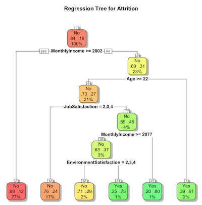
Now we plot the regression tree and save the graph
# Visualize regression tree using rpart.plot
rpart.plot(tree.model,
           main = "Regression Tree for Attrition",
           extra = 104, # Display probability of class and number of observations
           box.palette = "RdYlGn", # Color scheme
           shadow.col = "gray", # Add shadow for readability
           nn = TRUE) # Show node numbers
- rpart.plot(tree.model,…) plots a tree model.
- main=”…” sets the title of the plot.
- extra=104 controls the inforamation shown in each node:
- 100 -> shows class probability
- 4 -> shows number of observations in the node.
- Combining both we have both class probabilities and node sizes.
- box.palette=”RdYIGn” adds color to each node with Red->Yellow->Green color gradient
- shadow.col = “gray” adds a shadow behind each node’s box to improve readability.
- nn=True shows node numbers on the plot.
Random Forests
Next we perform Random forests (classification with valid mtry):
set.seed(1234)
model.rf <- randomForest(myformula, data = df, ntree = 1000, mtry = 2,
                         proximity = TRUE, importance = TRUE)
print(model.rf)
varImpPlot(model.rf, main = "Variable Importance")
- set.seed(100) bootstraps the samples and random fature selection for Random forests, which will make the results stable.
- model.rf <- randomForest(…) trains a random forest classifier.
- ntree = 1000 builds 1000 decision trees in the forest (heuristically speaking, more trees means stable results but it has a performance impact.)
- mtry = 2 means that at each split, the algorithm randomly selects 2 variables to consider, which is good for controlling overfitting. proximity = TRUE calculates proximity matrix, or how often pairs of sampels fall in the same terminal node.
- importance = TRUE stores variable importance metrics.
- print(model.rf) outputs a summary of the fitted model with:
- Error Rates
- Confusion matrix
- Class Distribution
- varImpPlot(…) plots variable importance measures:
- Mean Decreases in Accuracy: how much model accuracy drops if this variable is permuted.
- Mean Decreases in Gini: how important the variables is for reducing impurity in trees.
Alternatively we can split the data into training and test:
set.seed(123)
training.samples <- createDataPartition(df$leave, p = 0.7, list = FALSE)
train.data <- df[training.samples, ]
test.data <- df[-training.samples, ]

# Random forest performance (classification)
model.rf <- randomForest(myformula, data = train.data, ntree = 1000, mtry = 2,
                         proximity = TRUE, importance = TRUE)
predictions.rf <- predict(model.rf, test.data)
# Convert predictions to numeric for metrics
predictions.rf_numeric <- as.numeric(predictions.rf) - 1
metrics.rf <- data.frame(
  R2 = R2(predictions.rf_numeric, test.data$leave_numeric),
  RMSE = RMSE(predictions.rf_numeric, test.data$leave_numeric),
  MAE = MAE(predictions.rf_numeric, test.data$leave_numeric)
)
print("Random Forest Metrics:")
print(metrics.rf)
That sums up our introductory tutorial in R.